Lorem ipsum dolor sit amet. Proin gravida nibh vel velit auctor aliquet. Aenean sollicitudin, lorem quis biben dolor dum auctor, nisi elit consequat ipsum, nec sagittis sem nibh id elit.


DELIVERABLES
Brand Identity, Web Design, Packaging,
BRIEFING
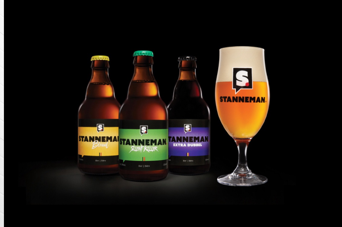
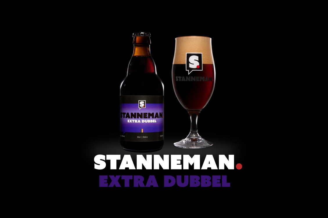
A small Belgian beer brand wants to rebrand their beer Stanneman after winning a beer contest. They wanted a more professional look, aiming for a modern, robust, industrial and slick appearance to stand out better in the beer world. Creating a strong foundation for their brand to grow on.
APPROACH
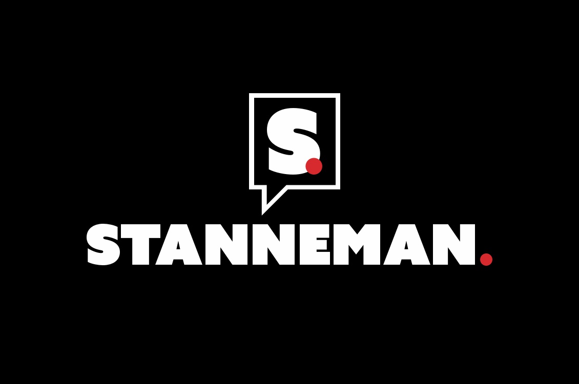
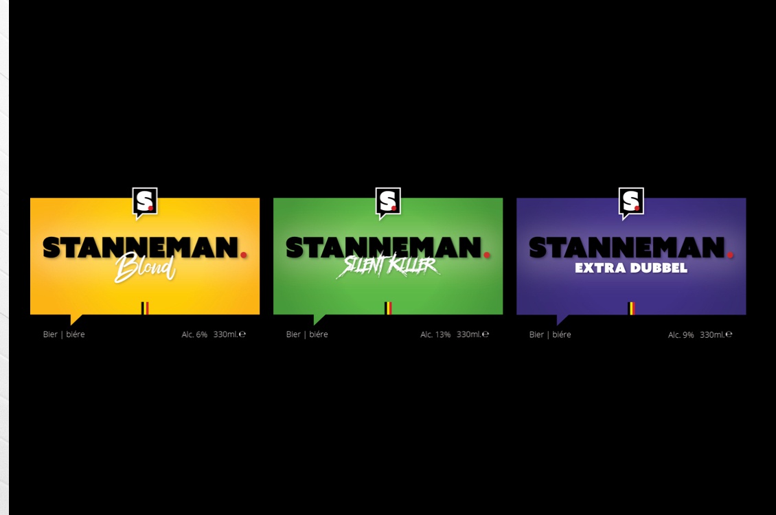
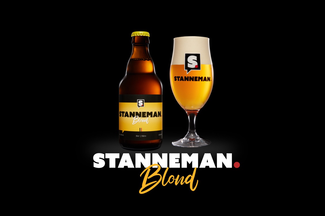
It was clear that the logo had to be easily readable to be instantly recognizable. Also important that the logo/name would be easy to remember and that it be mainly about the name rather than the picture. We started to create a strong written text logo for the main brand Stanneman. We want the brand to look robust and industrial. We chose written typography to communicate a clear message. In addition to the main brand, it is important that the different flavors tell well on their own what the characteristics of the flavor are. Through the use of colors and typography we were able to categorize stanneman into 3 different flavors.